When I starting planning to put a blog back up, I was looking for some key criteria to meet some goals:
- Low maintenance: Didn’t require constant security updates.
- Accessible: This speaks for itself, as I’m a proponent of inclusivity.
- SEO Friendly: Yep, wanna keep the search gods happy so the blog can actually be found.
- Performant: Who wants to sit around waiting on pages to load?
- Attractive: I wanted something where I could exercise a little creativity initially, something I don’t get to do a great deal in my current position.
Low maintenance
A CMS wasn’t going to fit the bill here, most of them require constant security updates to keep things secure. I was also interested in keeping hosting costs down, another reason for looking elsewhere, despite working with a CMS as part of my job.
I decided to go the route of using a static site generator. After trying several different ones (Tome, Ghost, Gatsby, and a few others) I finally settled on Astro. It was easy to learn, and the content pages for the blog are written in Markdown and MDX, which the theme I selected as a starter theme supports out of the box.
Accessible, SEO Friendly, Performant
Generally static sites are more performant than those powered with a CMS, unless you implement an entire caching strategy (not really wanting to maintain that either). I was looking to maximize my time spent blogging on the actual content, not on tweaking and maintaining the technology powering the blog.
The Accessibiilty and SEO Friendliness would require selecting the right starter theme for the project. After perusing different themes available on Astro’s Resources, I downloaded several that appealed to me and tried them out. I installed the themes, looked at the structure of the themes, and ran Lighthouse on the home page and the blog landing and detail pages.
One theme surfaced that, in my opinion, checked all of the boxes for me, and would serve as a great starter theme for this project: Astro Sphere.
Enter Astro Sphere
Astro Sphere is designed to be configurable. The Lighthouse scores were fantastic on all fronts, and I absolutely loved the dark mode, which I kept and modified to add some of my own touches. Winner, Winner, Chicken Dinner!
The styling is done with TailwindCSS, which is ok and I have prior experience with it so that works. At some point I’ll probably rewrite the CSS to remove Tailwind only because I don’t like all of the utility classes in the HTML markup, but that’s a future endeavor. I may decide it’s not worth the effort — we’ll see.
Did I mention sitemaps? The theme automatically generates the site maps needed for search engine optimization, and it has a really great search component, provides a well-organized faceted filter for the blog using the post tags, as well as a search page that is lightning fast, nothing fancy but it does the job. Nice!
A shout out to the creator of Astro Sphere, Mark Horn. So many hours of work saved using your theme as a launch point. Many thanks!
Customizations
I wasn’t terribly enamoured with the light mode in the theme, but I loved the dark mode. So I stared ideating about the direction to go with the light mode, and changes to the dark mode that I wanted top make. After a couple of hours of mulling it over, and doing some searches for ideas and imagery, a concept was born.
Dark Mode: A few enhancements
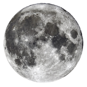
The background for the home page on the Astro theme, which looks like a starlit skyscape, was the thing that appealed to me. As I looked at the theme, I started noticing the details, such as the occasional shooting star that shot through the backgroud every few seconds, and the twinkling of some of the stars. I decided that something was missing, though, so I sourced a really great image of a full moon off of Freepix, downloaded, resized and optimized the image for the web, and starting playing with the presentation of the imagery.
After making some visual adjustments to the dark mode, I was pretty happy with the result.
Light Mode: Much more work here
Switching to the light mode, which has significantly more revisions, I wanted to keep the skyscape theme going, so I started looking for some animations in keeping with a day sky theme. I sourced quite a bit for some nice realistic looking sun images that could be used in the front page theme, but didn’t come up with any I was happy with. I did, however, find several different realistic looking “cloud” animations, one in particular that I thought really stood out head and shoulders above the rest.
So many creative people out there contributing their work to inspire others.
Another shout out, this time to Lorin Tackett and the fantastic job with the animated clouds shared on Codepen. I think they absolutely pop!
Again, made some visual adjustments to the light mode theme, and am fairly happy with the result, although I may keep tweaking. Or maybe not, adding too much would take away from the animated clouds, definitely a feature of the site (in my opinion, anyway).
The end result
I’m pretty happy with it, it’s easy to maintain, adding content is a breeze — with Markup and MDX support I can use code snippets, and add some light javascript when needed. Overall I think it came out well.
Yep, it’s a good starting point.
